
Tuesday
Correlation Matrix
Similarity Matrix
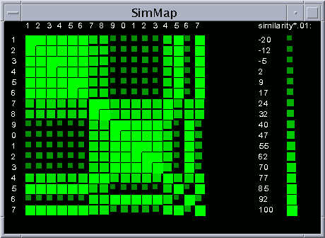
A similarity matrix is a graphic representation displaying scores that depict the similarity of two different data points.
Star Plot

Star plots are used to graphically show data with more than one variable. Each star a whole represents a single data set and the points to the stars represent the variables that represent the data set. Each star in the star plot above represents a type of car with the points representing variables such as price, gas mileage, engine type, etc.
Box Plot

A box plot is used to graph a numerical data set and show the middle, first quartile(25%), second quartile(75%), and also the highest and lowest values of the data set. The above box plots represent data from winning lottery ticket pay outs for three separate time periods, May 1975-March 1976, November 1976-September 1977, and December 1980-September 1981.
Parallel Coordinate Graph

A parallel coordinate graph is used to show multi dimensional variables on the same graph. Each variable corresponds to its own axis and can be compared to the other variables.
Triangular Plot

A triangular plot is used to graph and compare three separate variables, mostly in cartography they are used to compare rock and soil samples. The above triangular plot is a graph comparing types of soil.
Economic Map

A economic map uses symbols to illustrate what goods and services a country uses to fuel their economy. The economic map above depicts the country of Brazil and their economic sources in 1977.
Monday
Population Profile

A population profile shows the gender and age of all the people in a given geographic area. The above population profile is a depiction of Washington D.C.
Index Value Plot

Index value plots are used to show change in a variable that is constantly changing. Such values that are commonly graphed are rainfall, stream flow, and temperature. The index value plot above represents the non manufacturing index which relates to the success and failure of many manufacturing companies. In this case if the index value is over 50 the company is succeeding and under 50 the company is failing.
Lorenz Curve
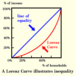
The lorenz curve is used to show inequality in a data set of numbers or in a area when referring to cartography. When illustrated it is the curved line below the line of equality which illustrates that data is not always equal. The lorenz curve shows the variance in a data set. The lorenz curve above is illustrated by the red curved line which represents the inequality between households and income.
Bilateral Graph

A bilateral graph is a graph that compares two similar variables. As you can see in the graph above the blue line represents the US trade deficit with the world in 2009 and the red line represents the US trade deficit with the world in 2010. The primary function of this graph is to show that since August of 2010 the US trade deficit to the world is on a downward trending run and if it will keep up.
Climograph

A climograph represents the monthly temperature and precipitation amounts for a given area in a graphical form. The above climograph is for Memphis, TN with the red line graph depicting the monthly temperatures and the blue bar graph representing the precipitation amounts.
DEM Map

DLG Map
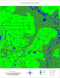
A DLG map illustrates cartographic features in the vector format and most are produced by the USGS. These maps can still contain detail such as bodies of water and such but for the most part they are a outline of the depicted geographic area. The DLG map above represents Tosohatchee Wildlife Management Area which is often referred to as having the largest stand of Cypress forest still left uncut in Florida.
DRG Map

A DRG map stands for a digital raster graphic which is essentially a scanned in digital version of the standard 7.5 minute USGS topographic maps. Many GIS type softwares use these maps as they are in digital form and can have layers added or removed from them. The above DRG represents an area of western Washington D.C. on the Potomac River.
Isopach Map

A isopach map is a type of isoline map that uses continuous lines to represent the true thickness of rock layers in a specific geographic area. The true thickness takes into account the lay of the land and is the actual thickness of each layer without taking into account geographic features. The isopach map above represents a oil reservoir site with the red dashed lines representing the isopachs, as you can see they don't necessarily mimic the contour lines, but they are in close correlation.
Isotach Map

A isotach map is a type of isoline map that represents areas of equal wind speed. The above map represents the entire United States and uses continuous lines to represent equal wind speed, also known as isotachs.
LIDAR

LIDAR stands for light detection and ranging and it is a system used to determine elevation of a specific geographic area. LIDAR is a form of remote sensing that uses light technology to determine the distance to an object, or the ground. The most common tool used is laser technology which can determine accuracy down to a half foot. The LIDAR image above represents ground zero after September 11, 2001 with the green area in the center where the towers once were.
Cartographic Animation
http://maps.unomaha.edu/AnimArt/article.html
A cartographic animation depicts a geographic area that wouldn't be seen as accurately through several maps. It often relates to the spatial or temporal scale in why it is better depicted as an animation. The video above is a cartographic animation of the Grand Canyon which allows the user to see the vast elevation change and the large expanse of which it covers. Cartographic animations are often times very hard to make and utilize due to their digital nature.
A cartographic animation depicts a geographic area that wouldn't be seen as accurately through several maps. It often relates to the spatial or temporal scale in why it is better depicted as an animation. The video above is a cartographic animation of the Grand Canyon which allows the user to see the vast elevation change and the large expanse of which it covers. Cartographic animations are often times very hard to make and utilize due to their digital nature.
Classed Cloropleth Map

A classed cloropleth map breaks down a variable to be shown on a map into several groups also known as classes. The above map depicts an area in Connecticut which is being studied to determine what is causing health ailments in the area. The map above specifically depicts the percent of low birth weight which has been broken up into 5 classes which are depicted from light to dark blue.
Range Graded Proportional Circle Map

Range graded proportional circle maps depict a varying statistic in a given geographic area. The difference between the standard proportional circle map and one that is range graded, is that instead of using standard values that usually are assumed by natural breaks, each circle represents a range of numbers as seen by the key.
Statistical Map

Statistical maps depict a variable feature that is present in a specific geographic area. Such that the map above represents the mean travel time to work for the entire United States. The map uses colors to depict the different time intervals with red being the longest travel time and dark green being the shortest travel time.
Isohyet Map

A isohyet map is a type of isoline map that represents rainfall amounts in an area. The above map depicts the mean October rainfall on the island of Kaua'i. The rainfall is depicted in mm with a range of 75-700 mm of rainfall present.
Sunday
Black and White Aerial Photo

Black and white aerial photos are the most common form of aerial photography. Even the most recent USGS aerial maps were made by using black and white film in cameras that were on airplanes. This is the most common form of capturing the images but nowadays many satellite systems are replacing the airplanes. The above image represents the Golden Gate Bridge in San Francisco, CA and was taken by a airplane at 40,000 ft.
Infrared Aerial Photo

Infrared aerial photos are the primary visual representation of remote sensing. These photos can depict numerous things about a ecosystem but also about objects such as the integrity of a roof. The image above depicts the deep water channels in Sacramento, CA.
Cartogram

A cartogram is a map that depicts a feature by either distorting its land area or distance. For instance the map above is depicting energy consumption, and as you can see the United States is very large and distorted due to its high use of energy.
Isotherm Map

Pictograph

A pictograph is a statistical map that represents a given data set by symbols or pictures. Similar to a stem and leaf plot but a graphical representation. The pictograph above shows the variety of apples that are shown at a local grocery store. From this a full apple represents 10 apples and a half represents 5 apples.
Isoline Map

A isoline map is one that uses continuous lines to represent areas of equal value on the map. For instance the map above was used to illustrate how a isoline is depicted by connecting all points with a value of 40. From here subsequent isolines can be drawn in the contour interval.
Friday
Isopleth Map

An isopleth map shows values of equal distribution in a three dimensional view. The map above is not a standard isopleth map as mostly they depict features that deal with elevation. In this case the elevation of the map depicts the percent of citizens that are working from home.
Proportional Circle Map

Proportional circle maps use varying size circles to depict the amount of a chosen feature. Likewise of many maps of this type the larger the circle the more of a specific feature is represented. In the case of the map above the circles are used to show population size of Native American Indians.
Cloropleth Map

A cloropleth map is essentially a thematic map that breaks down the information depicted by frequency using color. Cloropleth maps are commonly used to show population density or per-capita income, i.e. variables that vary from place to place. The map above represents the percent of Hispanic population in Florida. This map hits home especially because we live in the state.
Dot Distribution Map

Dot distribution maps use a dot to represent the feature they want to depict on the map. In the case of the map above the light blue dots represent the distribution of the wildflower species Centaurea cyanus.
Propaganda Map

Propaganda maps are maps that have been modified to be false to represent propaganda techniques. These maps were very prevalent in the 1900's and were a large for of mass slander that was easily represented. The map above is from the 1940's and relates to the fact that, "tea revived the world." Although this can be true in some cases the map depicts the whole world as benefiting.
Hypsometric Map

A hypsometric map is essentially a topographic map that shows elevation by the use of colors. A cartographer has to decide the tints to use to show the elevation the best. The map above shows a section of France that contains many different elevations. The green areas are low in elevation and the tan areas are of high elevation.
PLSS Map

PLSS maps were the first maps to document the United States land partitions. They were mostly used to depict the government land that would be sold off to benefit the citizens. The map above shows the meridians and baselines that were used to establish the PLSS mapping system. These lines are arbitrary but were decided on where they fit best.
Thursday
Cadastral Map

Cadastral maps show the property boundaries of a specific geographic location. This cadastral map is of Costa Rica and the neat thing is that by implementing these maps it made the property more secure. This has made it more appealing for people to buy land as now they have a physical map of their property. Also along with this it has made it easier for the government to identify and collect luxury home tax.
DOQQ Map

A DOQQ map is a satellite image of an area that is geometrically corrected to all be the same uniform scale. From this corrected satellite image true distances can be measured. This DOQQ map is of Louisiana post Hurricane Katrina. This map could be used by agencies at the time to aide in rebuilding and supporting the hurricane stricken areas of the state.
Doppler Radar

Doppler radar is used to determine the velocity of an object(mostly weather systems) without coming into contact with it. Doppler radar uses microwaves to determine the change in wavelength to determine velocity, also known as the doppler effect. This doppler image depicts Hurricane Katrina as it made landfall with Louisiana. This is the most prevalent doppler image in recent times due to the destruction the storm caused.
Isobar Map

Isobar's show areas that have the same atmospheric pressure and are depicted by concentric lines labeled with the pressure they represent. The above image represents both a low and high pressure system with isobar's surrounding each representing either an increase(high) or decrease(low) in atmospheric pressure as you move towards the center.
Nautical Chart

A nautical chart is very similar to a bathymetric map in that it shows the depth of the water, just in numerical form instead of graphical. Nautical charts are essential for any type of passage even though nowadays GPS are outsourcing them. This nautical chart shows the Gulf of Mexico and is 1:2,160,000 which is a very small scale for a nautical chart. Ones used for primary navigation are usually 1:10,000-1:80,000. This chart is significant to me as I have done much sailing in the Gulf.
Bathymetric Map

A bathymetric chart is essentially a topographic map that shows the sea. From the image above of the Gulf of Maine you can see the depth and contours of the seafloor through color and shading. This map is special to me as this past summer I raced sailboats all up and down the coast of Maine.
Thematic Map

A thematic map is a map type that is used to show a particular theme in a depicted geographic area. In the case of the thematic map shown above it shows the republican/democratic party control of the Governors office as of January 2007. From this map many political inferences can be made accordingly.
Topographic Map

Wednesday
Scatter plot

Scatter plots are a graphical representation of two separate variable values. They are used to show a correlation between the two variables which can be positive, negative, or random. This scatter plot shown represents median home value to the median rent. Which as the scatter plot shows has a positive correlation, so as the median home value increases so does the median rent and vice versa.
Wind Rose

Meteorologists use wind roses to determine the distribution of wind speed and direction in a given area. This wind rose depicts an area in Nebraska from 1996-2005 with the prevalent wind direction being shown as a west wind. This information can be very important when studying the climate of a particular area.
Histogram

A histogram is used to graphically represent the distribution in a given set of data. Similar to a stem and leaf plot but it doesn't list the whole set of values just the frequency in which they occur. In this histogram the heights of 30 people are taken and represented on the histogram. From this histogram one can tell that the most prevalent height of the people was between 149.5-159.5 cm's tall seeing that it occurred 9 times.
Stem and Leaf Plot

Stem and leaf plots are used to organize quantitative data in a graphical format. Often times they are used to represent a range of numbers to more easily be analyzed mostly from a distribution aspect. The stem and leaf plot shown represents the test scores of a given class. From the data one can tell that the test scores were distributed toward the 80-100 range.
Planimetric Map

Tuesday
Mental Map

Mental maps refer to those that a human has stored in their memory. Often times mental maps are used to depict a nearby location such as directions to a place someone is not familiar with. This mental map is of the Nottingham City Centre in 1997 and as you can see the map is not to scale or exact measurements, it is how a human depicted Nottingham City Centre from memory.
Subscribe to:
Posts (Atom)